Essay by Jade Armstrong for Contextualising Practice
Introduction
As Fingerhut and Prinz have articulated, the value of art traditionally depended on aesthetic beauty, though over the last decade, notions of value have shifted towards sensory engagement (2018). According to Dewey the emotions and bodily sensations experienced during the encounter with an artwork are considered to determine its transformative power (1934). This essay will combine colour theory, neuroaesthetics, and psychology principles, to explore the affective power of the colour pink. According to Schauss the colour pink has a strong embodied and calming affect, momentarily tranquilising viewers (1979). This essay will focus on my immersive, kinetic, pink sculpture, Distant Rays (2022), installed at the RMIT School of Art Graduates exhibition. The discussion will outline my science-based art practice, my initial intentions for Distant Rays (2022), the affect of pink-coloured sculptures, and later reflections on the artwork. Through this discussion, I will reveal the often underrated and unassuming power of the colour pink, which can simultaneously seize viewers’ attention and induce a sense of coolness. Pink’s powerful affect has the potential to entice viewers to engage with an artwork and produce a lasting effect.
I begin with affect. Or at least affect begins with me… sometimes I am struck with an elusive sense, the rare presence, the affect of a material, an idea, or a concept…I am trying to recreate that original moment of wonder.
(Armstrong, art journal, April 2023).
Transformative Practice
As the artist and philosopher O’Sullivan (2001) has noted, affect differs from effect. In art, affect is the instant bodily response to a work, whereas the effect is the series of thoughts that occur afterwards. The significance of affect in the creation and reception of art, as discussed by philosopher Massumi (2002), lies in its ability to evoke visceral responses, transcend linguistic limitations, and engage audiences at a primal level, thereby enriching artistic experiences and expanding the possibilities of aesthetic engagement. The act of viewing an artwork creates an embodied experience. This experience is defined as affect, which O’Sullivan (2001) explains is the momentarily intense emotions, feelings, and bodily sensations triggered by external stimuli. I believe that affect determines if a work is considered art, and if the work has no affect then it is not art. Massumi (1995) expands on this idea by exploring concept of affective intensity and highlighting the power and forcefulness of affective experiences, which can be experienced in varying degrees of intensity. This is extended by Deleuze’s (1988) description, which emphasises the capacity of affect, as pre-individual bodily forces, to shape subjective experiences before individuation. By democratising this experience, art becomes a catalyst for transformative social and political change. This sentiment echoes the perspective of influential American philosopher Dewey (1934), who argues that art should primarily be viewed as an aesthetic experience.
Drawing inspiration from Dewey’s (1934) and O’Sullivan’s (2001) philosophies, my art practice focuses on creating transformative art experiences and unexpected embodied encounters that stimulate self-reflection and introspective change. Through interdisciplinary work, I combine scientific research and psychological studies, to construct immersive sculptural installations and interactive public artworks. My artistic process begins when I research scientific theories or encounter new materials and I have an embodied reaction. The bodily affect of a raw material or concept prompts me to begin a new artwork. In 2022, I experienced a bodily reaction to citrus dichroic film as it was able to transform white light into pink and green hues. I was physically struck with a sense of awe and decided to use dichroic film as a material to create a pink kinetic light sculpture titled Distant Rays (2022).
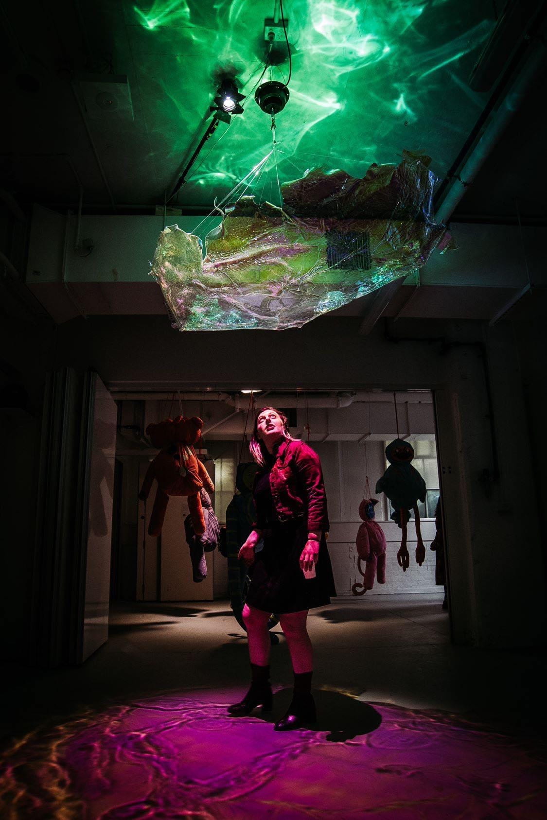
The encounter with Distant Rays (2022), seen in Figure 1, offers a unique and captivating sensory experience that draws viewers into a world of pink hues. When viewers approach the sculpture, they are greeted by an abstract cloud crafted from thermoformed acrylic and citrus dichroic film, suspended above eye level. Illuminated by an overhead white light that filters through the film, the sculpture slowly rotates, casting a circular pink pattern onto the ground. The interplay of colours, with blue hues also reflected onto the ceiling, creates a visually stunning atmosphere. Viewers wander beneath the work and find themselves bathed in gentle pink light.
My interest in the sensory aspects of art led me to plan an accompanying soundscape and scent for the installation. The soundscape was intended to subtly fade in and out of hearing. It comprised ambient recordings from a Finnish winter and harmonious notes I played on sound-healing instruments. Additionally, I had planned to infuse the environment with a fresh and sweet essential oil. However, due to the overpowering nature of the scent, my class tutors advised against its inclusion in the exhibition. This suggests that the bodily affect of the scent was strong. Its pungent nature drew some viewers (such as myself) towards the artwork and deterred others from it. Despite the scent not being included, encountering my artwork Distant Rays (2022) was an immersive sensory experience heightened by the captivating allure of the colour pink. Viewers respond to the sculpture with a range of emotions, finding solace and joy in the gentle pink light. The impact of pink on the perception and emotional state demonstrates its transformative power within the artwork, engaging viewers in an affective encounter.
Distant Rays is an imagining of what it would feel like to be inside a crepuscular ray.
(Armstrong, art journal, October 2022).
Reflection – in and on – Action
In the realm of creative practices, it is typical for the intended theme of an artwork during its creation process to differ from the theme realised upon gaining critical distance from the work. This act of reflecting on one’s practice mirrors the discussion put forth by prominent philosopher Schön (1983), who outlines two elements of reflection: reflection-in-action and reflection-on-action. The distinction lies in the timing of the reflection. In an art context, reflection-in-action occurs during the creation of an artwork, while reflection-on-action takes place after the artwork is completed and allows artists to discover novel insights. While creating Distant Rays (2022), I initially believed I was exploring a weather phenomenon and the creation of a meaningful place. Upon later reflection, I discovered that my actual focus was on the affect of the colour pink.
Throughout the design, prototyping, and production of Distant Rays (2022), I approached the work as a visual interpretation of a myth I was told by my grandmother Dee. When I was a child she explained that the striking rays of light stretching from the sun to the ground are the connection between Heaven and Earth – they are a cosmic axis. Later I discovered my grandmother was referring to the natural weather phenomenon known as crepuscular rays. These rays are colloquially believed to connect the heavens to the Earth (Encyclopaedia Britannica n.d.). They manifest as reflections and refractions of colours, often occurring during sunset due to breaks in the clouds (Met Office n.d.).
Through Distant Rays (2022), I intended to recreate the meaningful place experienced when I stood alongside my grandmother, listening to her myth. Place, as the geographer Creswell notes, is widely accepted as a ‘space invested with meaning in the context of power’ (Creswell 2015:12). Political geographer John Agnew (1987) builds on this definition and outlines meaningful place as the alignment of location, locale, and sense of place. I sought to create a meaningful place through the lens of the literalist art movement. Art critic and historian Fried described literalist art as an experience that ‘includes the beholder’ (1967:13) to create a cohesiveness and presence with the broader world. Distant Rays (2022) was embedded with meaning as it represented the location of a precious memory with my late grandmother. The work also followed Fried’s (1967) principles by bathing viewers in pink light, creating stillness and a reflection experience.
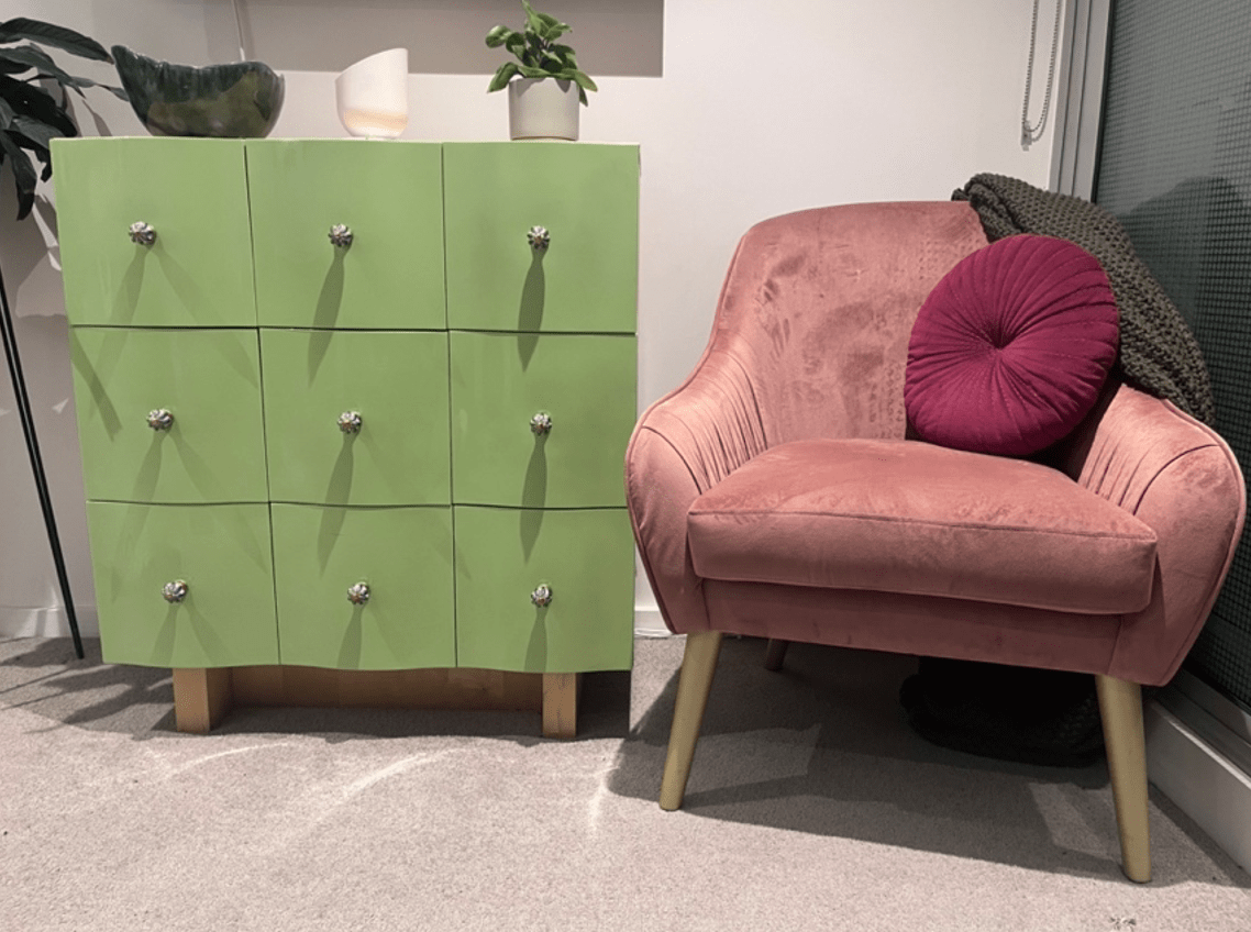
Six-months after the exhibition of Distant Rays (2022), I gained more critical distance from the work, allowing me to reflect-on-action. In doing so I recognised a common thread weaving through my personal life and artistic endeavours. Dusty pink has become a noticeable feature in my home décor (as seen in Figure 2), wardrobe, and artwork over the past three years. For me, pink radiates a calming and joyous affect. This subconscious affinity for the colour may stem from a traumatic experience when I felt unsafe in my home three years ago. Unknowingly, I have surrounded myself with pink to find solace, seeking its positive and calming influence on my psyche. As a result, this hue has insidiously seeped into my artwork, functioning as a healing agent for both me and those who encounter my works, including Distant Rays (2022).
To me pink is wonder. It is calm. Soft. Feminine. Not only a colour, it is a feeling.
(Armstrong, art journal, December 2022).
The Affective Power of Pink
I have been instinctively drawn to pink over the past few years for its calming and joyous affect. Though only after a viewer of Distant Rays (2022) remarked, ‘it is impossible to feel anger under this pink light’ (personal conversation, 22 November 2023), did I begin to consciously understand the colour’s affective potential. According to Elliot and Maier the colour pink has an embodied endocrine-based weakening affect on muscle functioning (2014). Psychophysiologist Schauss (1979) defined the shade Baker-Miller Pink and completed experiments to understand its impact on neurochemical channels within the body. By focusing on the Baker-Miller Pink sample in Figure 3 for fifteen seconds you can initiate your own experiment observing your embodied response and the affect this hue evokes.
Similar to the aforementioned Baker-Miller Pink test, Schauss (1978) completed a Kinesoid experiment to understand the physical response of a subject’s muscle strength. He observed that the colour pink had a calming affect, reducing aggression and violence by causing muscular relaxation. Psychology researchers Ou et al. (2004) built on this research, determining that the affect of colour differs depending on the subjects’ geographic or cultural background. However, the Colour and Imaging Institute (2004) found that pink transcends cultural differences. This is due to pink being a tint of the colour red, which has an evolutionary neural response, as historically, it was vital for humans to respond quickly to red as it could be blood. As Smith has noted the affect of the colour red is an embodied positive sense of power, energy, and strength (1999). In contrast, pink soothes rather than stimulates. Pink can evoke sensory responses and elicit affective experiences, such as calm and tranquillity (Schauss 1979). The scientific affect of pink reflects my own experience with the colour and that of viewers of Distant Rays (2022).
The colour pink was a central element of Distant Rays (2022), which impacted viewers’ perception and emotional state. During the School of Art Graduates exhibition, I observed children who were perhaps drawn by the enchanting pink light, running beneath the artwork, and playing within the circle of light it creates. Other viewers stood around the circle of light, as they were reluctant to disrupt its ‘magical presence’ (personal conversation, 22 November 2023). They observed the intricate patterns and hues formed in the projected light. A few viewers stared in wonder at the white light, curious about how it could project such an intense colour. Others stood underneath the sculpture, basking in the gentle pink glow that bathed them. The allure of the pink light became a catalyst for various responses, it engaged viewers on both an emotional and sensory level.


While artists employ pink in their works, the reasons for doing so which they articulate vary. Yet, perhaps their underlying motive resonates with my own, wherein pink functions as a conduit for affective experiences. As an illustration, let us examine the artworks of Cyril Lancelin, who employs pink to create a stark contrast with urban environments (Fed Square 2021). An example is Lancelin’s (2021) The Knot, as seen in Figure 4. Through his choice of colour, Lancelin incites affective experiences within viewers, evoking sensations of calmness and tranquillity. Perhaps, Lancelin actually employs pink in his artworks primarily because of its affective power? Olafur Eliasson is another artist who may have been drawn to pink due to its affective qualities. In Opera House Chandeliers (Eliasson 2004), Eliasson uses the same dichroic material I used for Distant Rays (2022). Interestingly, Studio Olafur Eliasson (2004) discussed the project as an exploration of natural light. Though, similar to my own art practice, Eliasson is interested in creating a sensory encounter and inspiring wonder (Engberg-Pedersen 2018). Perhaps both Cyril Lancelin and Olafur Eliasson were responding to the same embodied affect of the colour pink which inspired me.
While observing the viewers’ reactions to Distant Rays (2022), it became evident that the colour pink evoked a range of emotions and sensations. The softness and warmth associated with pink elicit a sense of tranquillity and calmness in those who encounter the sculpture. Viewers often experience a heightened emotional state, feeling at ease and immersed in the ethereal ambience created by the pink light. The colour pink is an invitation to pause, reflect, and indulge in a moment of serenity. It envelops viewers in a soothing embrace, offering respite from the outside world and allowing for introspection. Additionally, the colour pink holds cultural and psychological associations that contribute to viewers’ responses. Researchers Elliot and Maier (2014) found that pink has historically been associated with femininity and is often linked to nurturing qualities and affection. These cultural connotations further enhance the affective impact of the colour within the artwork. Viewers may subconsciously tap into these associations, influencing their emotional state and connection to my sculpture Distant Rays (2022).
In conclusion, this essay has explored the affective power of pink in art through an overview of colour theory, neuroaesthetics, and psychology principles. The discussion focused on my immersive, kinetic, pink sculpture, Distant Rays (2022), installed at the RMIT School of Art Graduates exhibition. The essay explored how through my science-based art practice, I create transformative art encounters, the subconscious emergence of my use of pink, and the affective power of pink in an art context. The underestimated and unassuming colour pink can captivate attention while inducing a state of calmness in viewers. As artists and creators, we must recognise the significance of colour in our artworks. Further research is required to understand the affect of other colours and tones in an art context. By embodying a sensory affect through encounters with pink sculptures, such as Distant Rays (2022), we hold the power to create transformative experiences that resonate deeply with viewers.
Reference List
Agnew J (1987) Place and Politics: The Geographical Mediation of State and Society, Allen & Unwin, Boston, USA.
Armstrong J [photograph by Mikko Robles] (2022) Distant Rays [citrus dichroic film on thermoformed acrylic, and a Dedo light], RMIT School of Art, Melbourne.
Colour and Imaging Institute (2004) Colour Psychology: the “Colour Affects” system, accessed 15 May 2023, OKI database.
Cresswell T (2015) Place: An Introduction, 2nd edn, John Wiley & Sons Ltd, Chichester, UK.
Deleuze G (1988) ‘A Philosophical Concept…’, Topoi, 7:111-112.
Dewey J (1934) Art as Experience, Capricorn Books, New York, USA.
Dole CM (2007) ‘The return of pink: Legally Blonde, third-wave feminism, and having it all’ in Chick Flicks, Imprint Routledge, doi:10.4324/9780203935552-10.
Eliasson O [photograph by Silke Heneka] (2004) Opera House Chandeliers [colour-effect filter glass, bronze, halogen bulbs, and glass], The Copenhagen Opera House, Copenhagen.
Elliot AJ and Maier MA (2014) ‘Colour psychology: Effects of perceiving colour on psychological functioning in humans’, Annual Review of Psychology, 65:95-120.
Encyclopaedia Britannica (n.d.) Crepuscular Rays: Atmospheric Phenomenon, Encyclopaedia Britannica website, viewed 27 August 2022. https://www.britannica.com/science/crepuscular-ray
Engberg-Pedersen A (2018) Olafur Eliasson: The Whys and Hows of My Art Making [interview pamphlets], Phaidon, London, UK.
Fed Square (2021) The Knot, Fed Square website, viewed 5 September 2021. https://fedsquare.com/events/the-knot
Fingerhut J and Prinz JJ (2018) ‘Wonder, appreciation, and the value of art’, Progress in Brain Research, 237:107-128, doi:10.1016/bs.pbr.2018.03.004.
Frassanito P and Pettorini B (2008) ‘Pink and blue: the colour of gender’, Child’s Nervous System, 24:881-882.
Fried M (1967) ‘Art and Objecthood’, Artforum, 5(10):12-23.
Lancelin C [photograph by Jade Armstrong] (2021) The Knot [inflatable sculpture], Fed Square, Melbourne.
LoBue V and DeLoache JS (2011) ‘Pretty in pink: The early development of gender-stereotyped colour preferences’, British Journal of Developmental Psychology, 29:656-667.
Massumi B (1995) ‘The Autonomy of Affect’, Cultural Critique, 31:83-109, doi:10.2307/1354446.
Massumi B (2002) Parables for the Virtual: Movement, Affect, Sensation, Duke University Press, Durham, USA.
Met Office (n.d.) Crepuscular Rays, Met Office website, accessed 27 August 2022. https://www.metoffice.gov.uk/weather/learn-about/weather/optical-effects/crepuscular-rays
O’Sullivan S (2001) ‘The Aesthetics of Affect: Thinking Art Beyond Representation’, Angelaki Journal of the Theoretical Humanities, 6(3):25-35, doi:10.1080/09697250120087987.
Ou LC, Luo MR, Woodcock A and Wright A (2004) ‘A study of colour emotion and colour preference. Part I: Colour emotions for single colours’, Colour Research & Application, 29(3):232-240.
Schauss AG (1978) ‘Body Chemistry and Offender Behaviour’, Correctional Training Personnel, August.
Schauss AG (1979) ‘Tranquilising Effect of Colour Reduces Aggressive Behaviour and Potential Violence’, Orthomolecular Psychiatry, 8(3):218-221.
Schön DA (1983) The Reflective Practitioner: How Professionals Think in Action, Basic Books, New York, USA.
Smith N (1999) Colour perception: A phenomenological study into people’s spontaneous physical, psychological, emotional and spiritual reactions, through experiential use, to colour [master’s thesis], Edith Cowan University, accessed 15 May 2023. https://ro.ecu.edu.au/theses/1238
Studio Olafur Eliasson (2004) Opera House Chandeliers, 2004, Studio Olafur Eliasson website, accessed 20 May 2023. https://olafureliasson.net
Yano CR (2013) Pink Globalization: Hello Kitty’s Trek across the Pacific, Duke University Press, Durham, USA.